Austin proux
You know that font you see everywhere that makes everything look pretty nice? It's Helvetica. It looks nice because it's very simple and formal. That's all you really nice to know, but if you'd like more information, I would suggest wikipedia. Watching this film past the 15 minute mark is a Beckett-esque act in absurdist torture.If you would like to watch the most uninteresting, boring, plain-spoken, dry people in the world talk about a single font for the totality of a feature length film, I'm not going to stop you, but I would certainly hope that child protection laws prevent any minors from being forced to experience this against their will. The most jarring thing about the film isn't any single aspect represented, but the fact that someone payed significant amounts of money to produce a feature length film about a font known specifically for its plainness and formality. It's a product purely made to be inoffensive in every aspect.One of my favorite reviewers has a common rating system regarding documentaries where you ask "if this was all fictional, would I still find this entertaining?" Well, judging by the fact that I genuinely believe that showing this to an unwilling minor should be considered child abuse, I didn't have a lot of fun watching this. I don't find the idea of a common, plain, nice font developed by very plain and common people very entertaining.
chaos-rampant
I have some writing background in the music press. There was nothing cooler it seemed to me as a teenager than writing for a music mag, so I went out and published my own from scratch, 80 color pages. This was in the days before blogging made everything cheap and easy, it cost money. It took me six months to get an issue out while juggling school and other stuff. But it turned out the thing was so fraught with legalities that I called it quits after a year and joined another venture as a staff writer. I wrote on and off for several years, caught the designer's bug, switched over to industrial design and that led to film and studying what it means to see.Anyway, one of the very first decisions in that trade is choosing the typeface. It has to be smart but readable and preferably communicate some identity. I was mostly clueless at the time, a lot of Impact and Papyrus for headlines. But I was drawn to Arial for the body, Microsoft's rather tasteless clone of Helvetica.They're not lying when they say Helvetica is everywhere. Chances are something was advertised to you in Helvetica today. Hell, you're reading this in Helvetica. There's a reason for this. It is its own composed aesthetic, and for a lot of people, you are the context you have paid to buy together with the trinket.So here's a very neat idea for a documentary; a look into the forms we use to build the context, skin and identity of our world.The guy responsible for this gets more in the way than illuminates. He spreads rather than delves, main concerns being generally about visual culture. We get various points of view, some of them insightful, some superficial.But another angle to consider is this. We have this new radical typeface invented to do away with the clutter of history and reflect a modern world. It is clean, blends perfectly, fits every use, in fact it is so empty of an idiosyncratic self it becomes what it means, we're led to think. The exciting thing born from idealism is soon used to sell things, how it happens most of the time.So we have subsequent generations of designers who consciously revolt against the culture that has appropriated the form by revolting against the form itself. They value individualism and expression above meaning. When they're done by the early 90's, design is a jumbled heap of grunge, post-modern attitudes lying on the floor in meaningless pieces - this is where I found it.But there is an old Dutch guy from that school of modernists that were creative at around the same time as Antonioni and others. It is not about the symmetry of form, he says, it is how you handle intermediate space, the emptiness around the thing. The breath of air that holds it together - aspiring filmmakers should take notice.Herzog could spin this more powerfully to be about the emptiness behind the signs we devise to navigate the world, designed to reflect being and order, beauty out of chaos, probably via eccentricity.Perhaps the typeface itself reveals as much. The tremendous success of Helvetica is a form that has been shaped to give the impression that it has sprung naturally from the sign. It eludes by the anonymity of pure function. Selflessness is its beauty.Forget that you now see it in airline signs. The original ideal was something that reflects the author. On a whole other level, it's the same principle that guides Zen calligraphy.
TheDocHierarchy
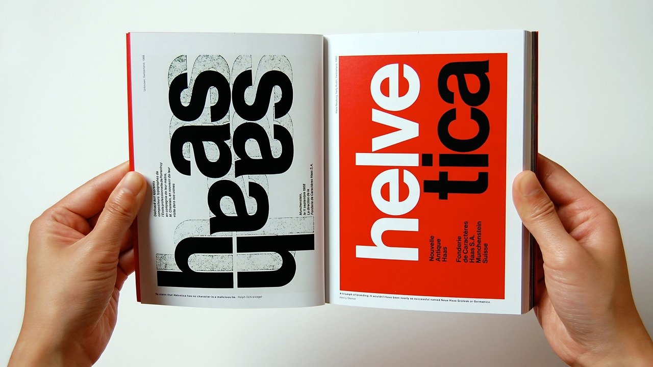
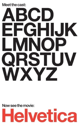
The year 2007 marked the 50th anniversary of the Helvetica typeface. To most people, this little nugget of information (#fact if you will) means very little. Begin to show them however just how ubiquitous and ever-present Helvetica is in their everyday lives and you'll have their interest. Hustwit certainly got mine very early on.From street signs to Nike advertising campaigns, from littering notices to shop billboards, Helvetica is omnipresent. We must see thousands of words and phrases a day that use the Helvetica typeface, yet far from wonder why the typeface is always identical, we don't even recognise they are in fact the same typeface. Hustwit's 'Helvetica' delves into this gap, one that didn't exist for the viewer before the film started, but quickly engages our curiosity: why is it used so uniformly? why does it look so...clear? what does that say about us? where did it come from? who creates this stuff? It is a courageous director who opens that can of worms, but Hustwit takes to it with relish.Taking us back to Switzerland in the 1950s, the field of typography is laid out in full by a panoply of talking heads ranging from modern-day typographers, to graphic designers, to mere (and I use that reluctantly) artists. Perhaps fittingly, the issue of Helvetica's omnipresence remains the centre of attention for all those interviewed, how can they explain away the veritable phenomenon it has become? The range of responses elicited conveys a certain chasm in the field, the 'neutrality' that arises as the font's attraction is as much a joy and example of sheer artistry to one artist as it is depressing and mere bourgeois subterfuge to the next. The discussions of the aesthetic of the font, and of others' (failed) attempts to move beyond it, do risk at times moving beyond the film's appeal to the layman, but are forgiven for the passion they betray of the filmmaker and his subjects.As a font, Helvetica is more than simply an inspiration for the corporations that depend on its neutrality and aesthetic to promote their goods. It is an instrument that both lures figures into the design industry for want of its use and pushes those opposed to its capitalist connotations into usurping its ideals and creating their own fonts.Thus far, few have been successful and Helvetica reigns supreme on the street; have we reached the 'end of history' for typography? Helvetica may be its perfect form.Concluding Thought: Nothing to do with typography, but who knew 'Helvetia' in Latin was Switzerland? (#fact)
tedg
This is surely the best documentary I have seen. I use several metrics in this.A film is almost without exception a story. A documentary is usually presumed to be a found story, an existing one that the filmmaker merely exposes. We come to the thing expecting some coherent story, already formed, the problem having two threads: Can we trust the filmmaker? Does the story resonate? Often a solid position in one mitigates the other.But real life — at least the life I know — has no stories that are blunt. Real stories, the ones that weave themselves through the world, are rich, only somewhat visible, immensely intriguing and often educational. I expect to be puzzled. If there are "two sides," I immediately mistrust the teller, because true movement is simply itself.This film should be celebrated simply because it decides to present a story in its unformed state. We hear from designers young and old, clever and not. Some are geniuses and some see the genius of design and we have no idea which is which. They report profoundly different views on a typeface. Lest we think this is an irrelevant subject, the observations on the typeface are bridged by examples to show how thoroughly it has saturated. So we are left with the same form as "Ten Tiny Love Stories," perspectives that surround the notion and instead of pulling out the answer, illuminated the mystery. The simple fact is that this is a powerful, mysterious force that makes us do things. The comparison of font design and romance is not misplaced: both somehow relate to the bricks of stories we use in constructing a life — or for some of us a fort to protect from life.So I can recommend this to you. I recommend seeing it with your partner, your real partner. And then sit with them quietly and reflect on the nature of clarity and knowing.I can criticize this though. There is much that could easily have been said that wasn't.Its usually presumed that spoken language is quite old and written language a relatively modern technology compromised to make it persist. In this context, type design is merely a matter of style, a choice.But there is evidence that spoken language predates modern humans and evolved over time through collaborative toolmaking, most particularly weaving and stonechipping. Acts of hands. Shapes -- physical form, with symmetries. Spoken language in this history is itself an adaptation, and written language perhaps closer to the core of how we think. In this history, shapes matter. The process of creating form in story — all manner of form — matters. The story is how the story is shaped.We bump against this intuitively. It was why the Macintosh was a giant step forward in the 80's, because storytellers could for the first time be storyshapers (publishers, in the corporate lexicon). And why Microsoft is such an evil. And why type design elements have become so deeply viral. The original features come from carved inscriptions and independently from monks' pens.Anyway, from that Mac beginning came a focus on type as never before. And several design journals that struggled with the issues spoken about in this film. Pulling them out of print to put on screen should carry some more weight than we have here. I am hoping that some truly talented filmmaker is inspired by this.The most edgy but still intelligent design and font design journal from the last decades is "Emigre," which you should peruse if this movie intrigues you. Also you might want to check out Darius, who was behind the first designed font.My typeface is Vendetta.Ted's Evaluation -- 3 of 3: Worth watching.